IKEA 2014 Catalogue
Events, Seasonal and Short-Term (SILVER)
Client Credits: IKEA Canada
Hilary Lloyd, Deputy Marketing Manager
Kirsten Ryan, External Marketing Manager
Jonelle Ricketts, Advertising Specialist
Agency Credits: Leo Burnett Canada
Judy John, Chief Creative Officer
Lisa Greenberg, SVP Creative Director
David Federico, Group Creative Head
Morgan Kurchak, Group Creative Head
Anthony Chelvanathan, Group Creative Director, Art Director
Steve Persico, Group Creative Director, Copywriter
David Kennedy, SVP General Manager
Natasha Dagenais, Group Account Director
Allison Tang, Account Supervisor
Rebecca Simon, Account Executive
Dustin Rideout, Strategic Planner
Client Name: IKEA 2014 Catalogue Client Credits: IKEA Canada Hilary Lloyd, Deputy Marketing Manag
Heather Morrison, Social Media Planner
Anne Peck, Print Producer
David Eades, Print Producer
Thomas Degez, Digital Producer
Julie Caniglia, Broadcast Producer
Media Agency:Jungle Media
Brooke Leland, VP Connection Planning
Section I — BASIC INFORMATION
| Business Results Period (Consecutive Months): | August 12 – September 8, 2013 |
| Start of Advertising/Communication Effort: | August 12, 2013 |
| Base Period as a Benchmark: | 2012 |
Section II — SITUATION ANALYSIS
a) Overall Assessment
Can 38 feel young again?
Once a year, for the past 38 years, the legendary IKEA Catalogue lands on the doorstep of Canadians. It marks the beginning of a new year and the launch of new product range. As an annual publication, it solidifies IKEA’s style point of view for the 12 months ahead, positioning them as the leader in home furnishings. However, our world and technology have rapidly changed in the last few decades. While people expect to receive the new Catalogue every fall, their anticipation of its arrival has dwindled.
Canadians receive on average 150 catalogues, flyers and promotional material in their mailboxes each month[1]. And in today’s era of digital and DIY, inspiration is ubiquitous. We are flooded with highly curated and easily accessible blogs, eNewsletters, and social platforms like Houzz.com, Pinterest and Instagram, all of which provide a steady stream of aspiring home furnishing ideas, and inspiring ways to decorate the home at any given time of year. How is the IKEA Catalogue, a book that comes once every fall, supposed to have the shelf life to compete with the abundance of fresh, new content that is spoon-fed to us on a weekly, daily and hourly basis?
Market factors haven’t helped the situation either. The home furnishings market performance was down by 1% from 2012[2]. People may seem interested in the category by frequently pinning and sharing their favourite rooms, styles and must-have décor items with their network. But in reality, people were not spending more money on home décor.
IKEA was faced with a challenge in 2013. Despite unremarkable market performance and inspiration coming at us at every angle, there was pressure for IKEA to generate excitement about the launch of the new Catalogue, and motivate people to visit and shop at their local IKEA more frequently than the previous year. As the Catalogue itself is a proxy for the IKEA brand, IKEA had to prove with people that none of the other décor sources out there quite compare to the level of IKEA inspiration that they receive every fall.
This case study will prove how IKEA reinvigorated people’s interest in what’s inside the pages of a tired media, and how feeling inspired about home décor translated into feeling inspired about life at home with IKEA, all of which drove strong business results.
b) Resulting Business Objectives
Making a positive impact despite category decline.
Our business objectives were established based on the previous year’s Catalogue launch:
- Increase visits to store during the campaign period
- Increase sales during the campaign period
- Increase traffic to IKEA.ca
- Increase downloads of the IKEA Catalogue app (iOS + Android)
c) Annual Media Budget
$1 – $2 million
d) Geographic Area
National (Canada)
[1] Source: Canada Post
[2] Source: Stats Canada 2013
Section III — STRATEGIC THINKING
a) Analysis and Insight
Celebrating the joy of change with a new Catalogue each year.
In order to keep the focus on IKEA, we needed to find a way to show how the Catalogue is not only distinctively IKEA, but signal to Canadians that IKEA understands people’s unique relationships in and around the home. We needed to move people from feeling intrigued about IKEA to feeling excited about furnishing with the new Catalogue.
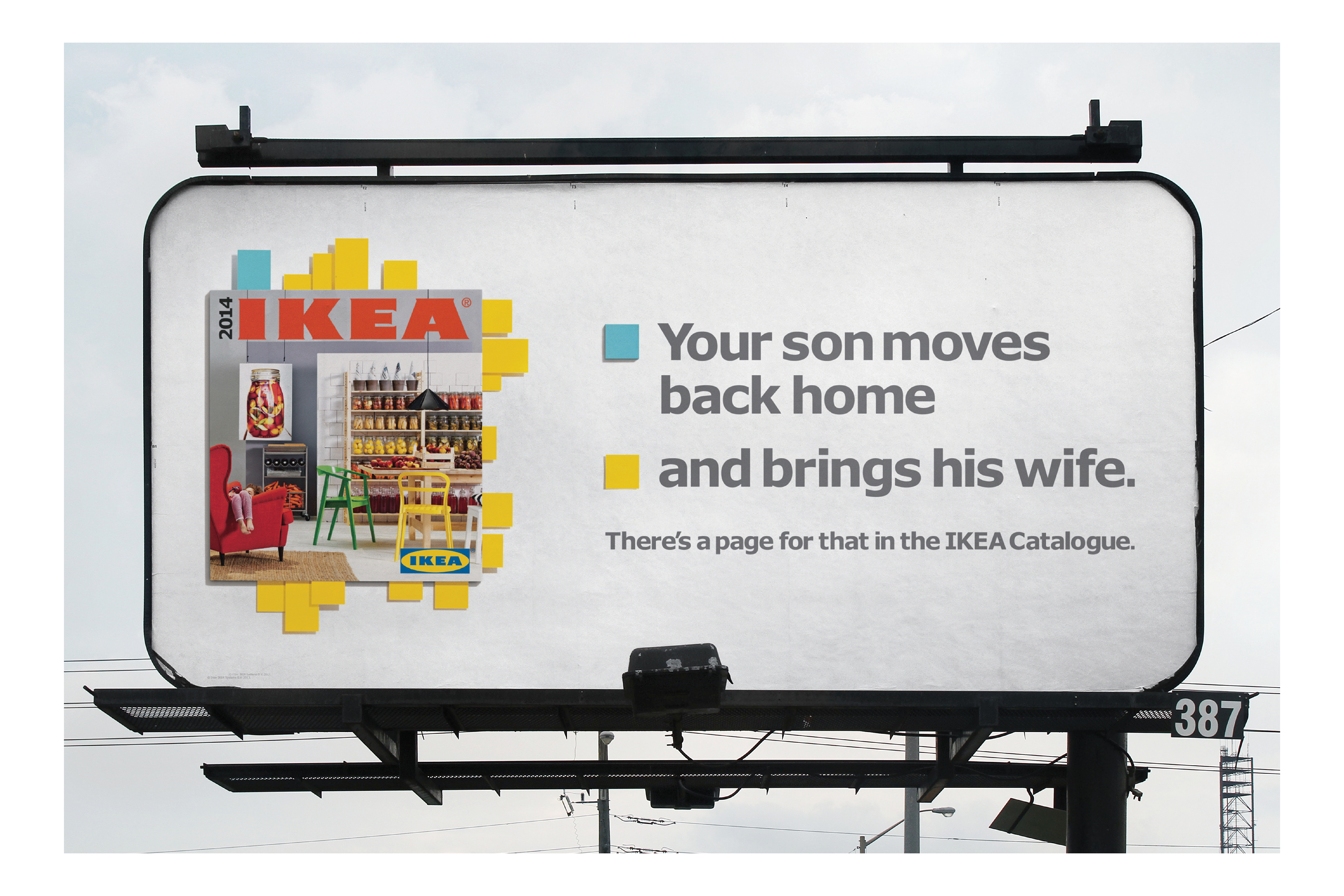
The first insight was uncovered by realizing that the need to change up home décor, planned or unplanned, happens throughout the year. Whether it is a result of life changes, like when your wife discovers she’s pregnant, life stages, like when your son moves out for college, or those small things that bother you over time, like the forgotten corner in your bedroom, or the overflowing drawers in your disorganized wardrobe. People need inspiration to recognize and internalize the décor need at home, and solutions to trigger store visitation and purchase to realize those changes at home.
The second insight is that inspiration is omnipresent. People are enthralled with the constant crop of new ideas, opinions, and tips in all their media forms that deliver a stream of inspiring ways to design, furnish and refresh the home. While the sources out there all evoke a “you can do it” mentality, it’s easy to feel overwhelmed and unsure of how to pull any of it together.
But the IKEA Catalogue is unique. It’s not simply a catalogue of products; it is a change management tool. Each issue contains hundreds of pages of inspiration, beautiful rooms, stylish and affordable products, and smart organization solutions for everyone, no matter the living situation. The Catalogue not only stimulates people’s interest in home furnishings, but also provides thoughtful ideas on how small, inexpensive additions can actually change the way you feel, think about and experience a smarter, better everyday life at home. We concluded that while life changes throughout the year, our strategy would be to ensure that the IKEA Catalogue was positioned as the source of inspiration to help you make the most of life at home.
b) Communication Strategy
Maintain the Catalogue as the source for home furnishings.
Based on our insights, we needed to demonstrate how the new IKEA Catalogue is an unequalled source of evergreen content and actionable ideas that can motivate people to make the most of their life at home.
Throughout the campaign, we highlighted common pain points as a result of change that would compel people to refresh their homes, and motivate them to turn to IKEA, the only brand that truly understands how to make the process of home décor easy and affordable.
To reinforce IKEA as the leader in life at home, we called out real life situations, and along with it, pages in the new Catalogue that offered a wealth of ideas and solutions that could address any room, nook and cranny of the home.
Section IV — KEY EXECUTIONAL ELEMENTS
a)Media Used
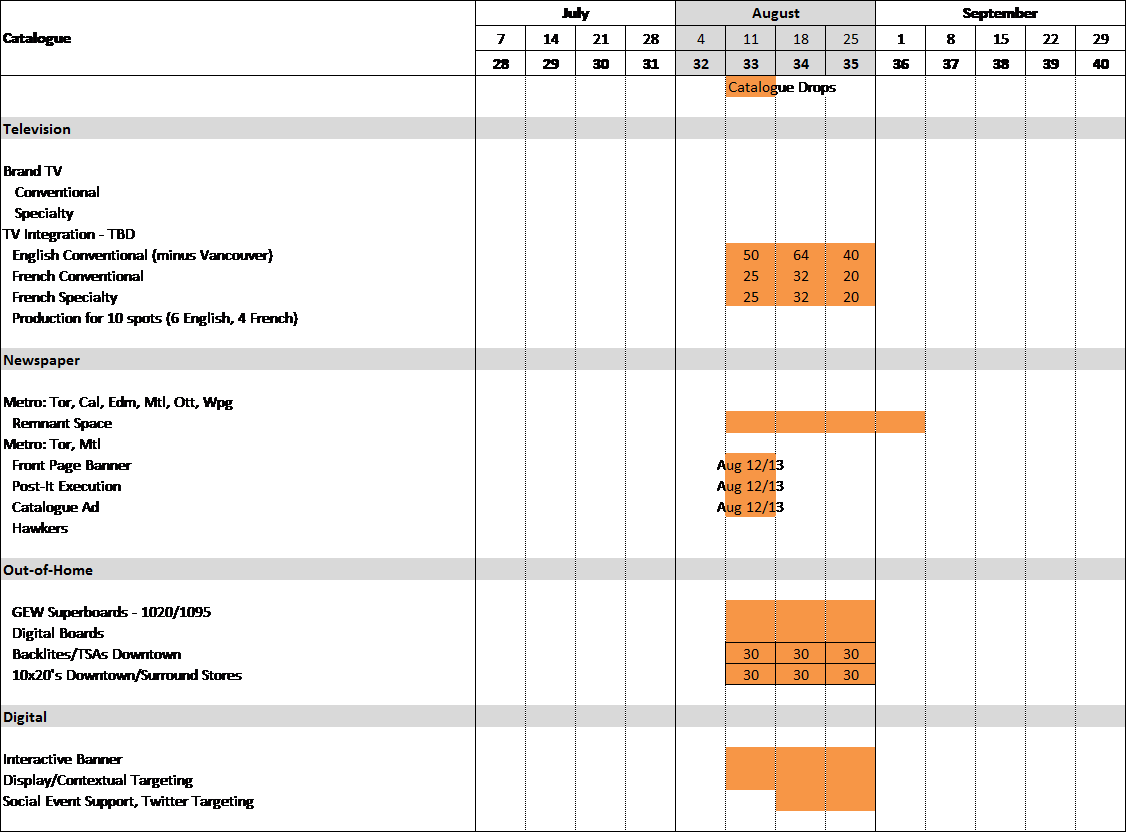
We used the following combination of traditional, ambient, digital and social media to bring our campaign to life:
- TV :15 spots; some television content integration
- Newspaper: Commuter Papers
- OOH: Superboards, digital boards, transit shelter ads, 10×20 billboards, regular and megacolumns; some location-specific boards
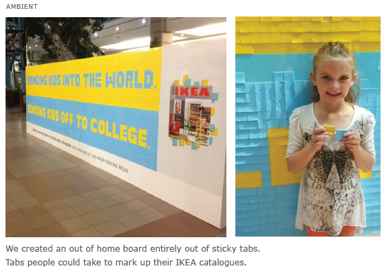
- OOH Ambient display board made of real sticky notes
- Digital: Rich and standard banners
- Social: Facebook Promoted Posts, Twitter Promoted Tweets
b)Creative Discussion
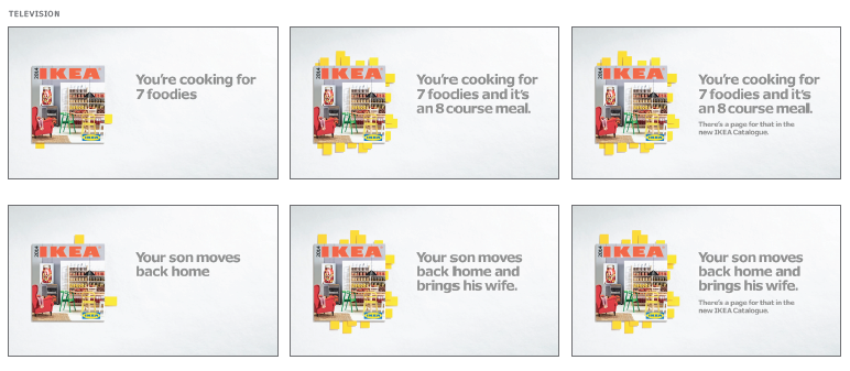
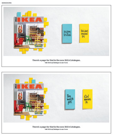
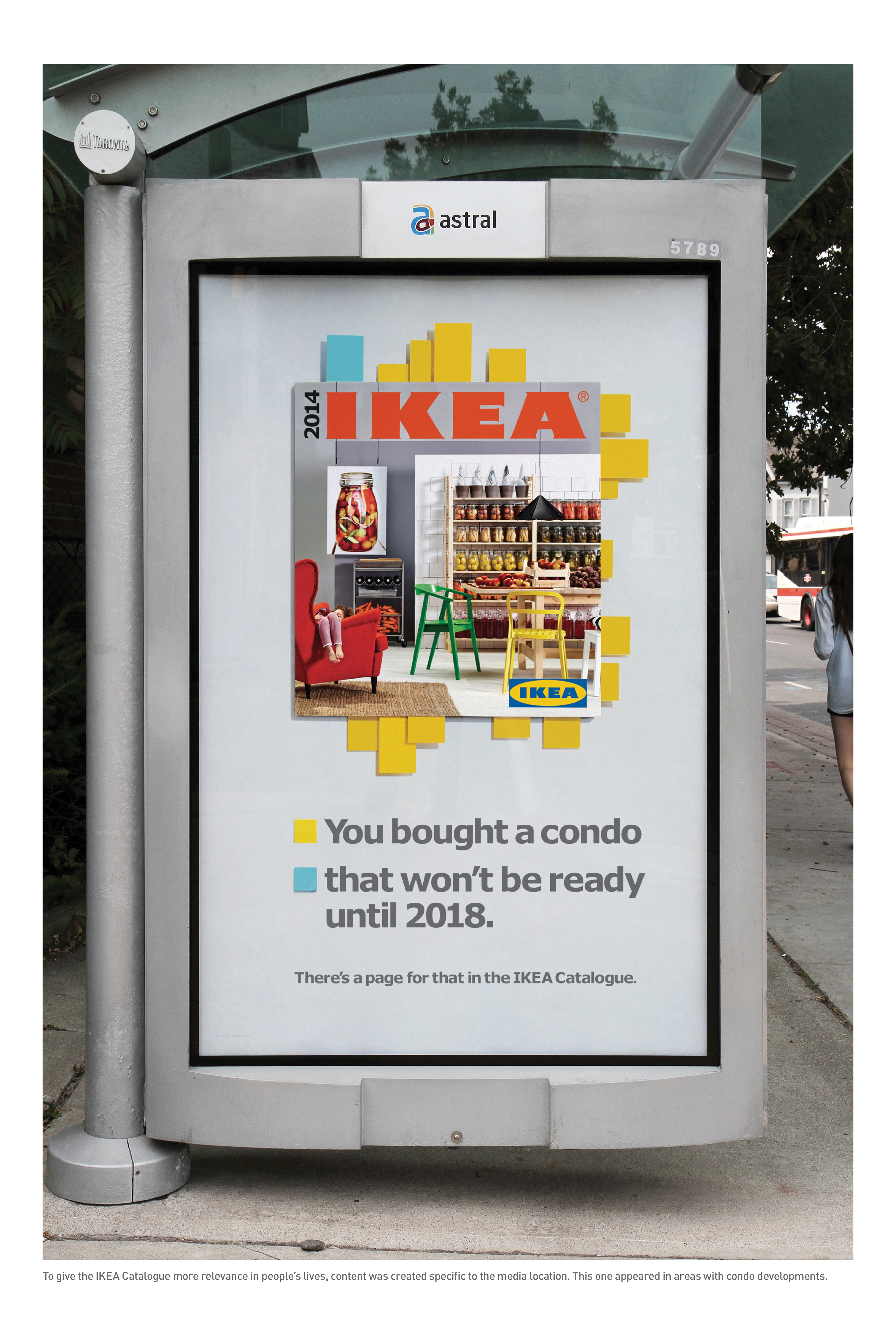
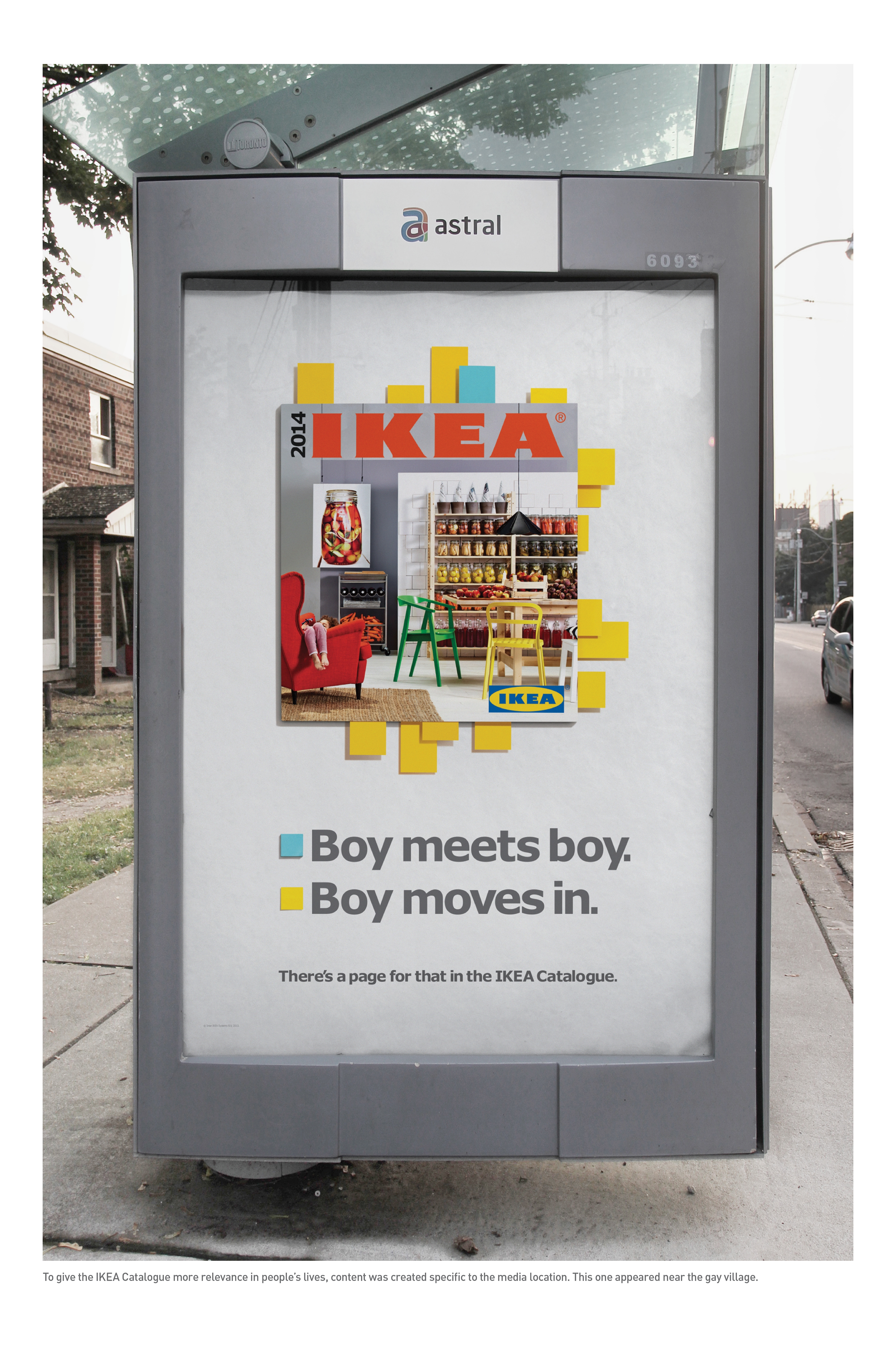
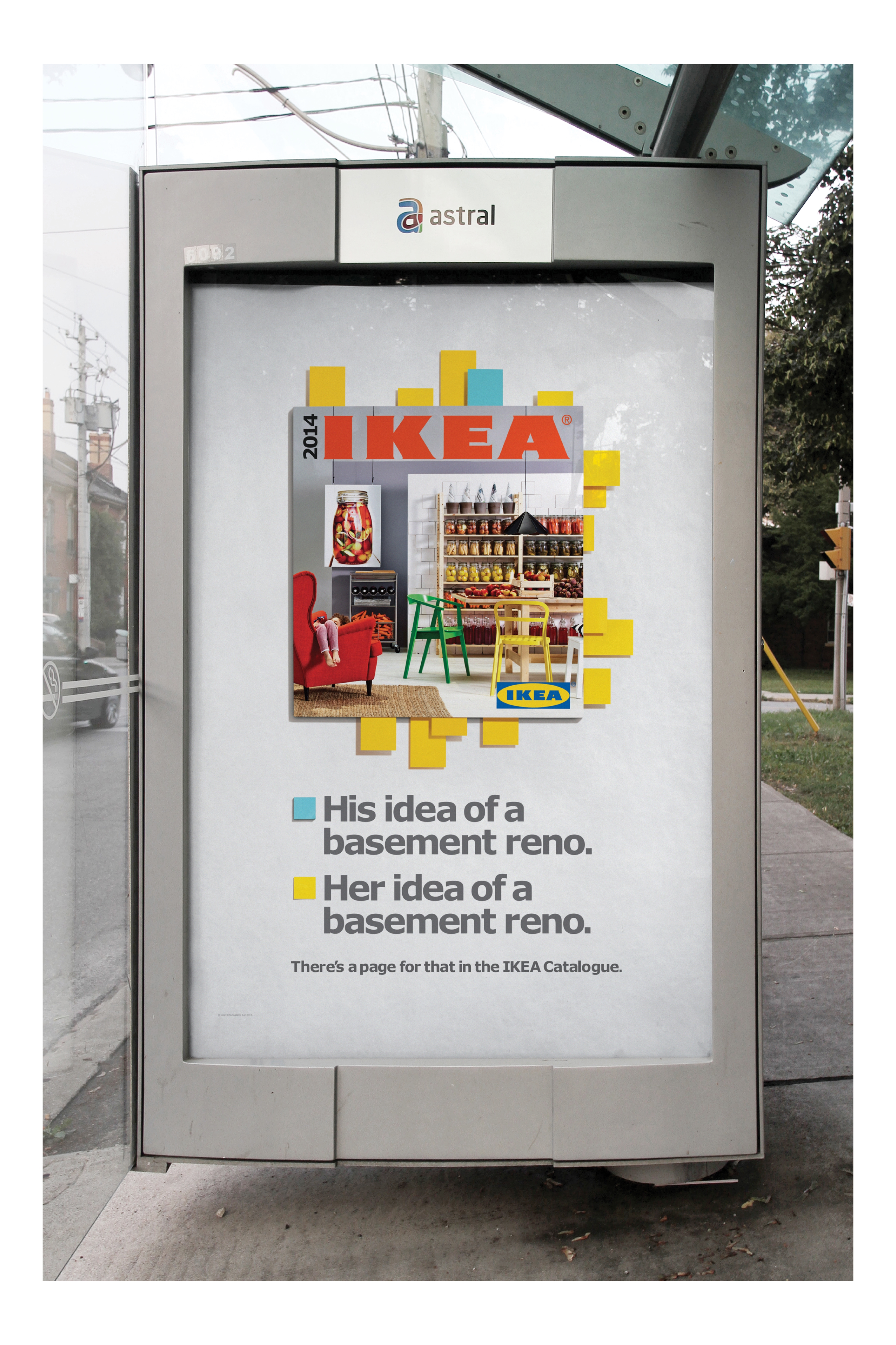
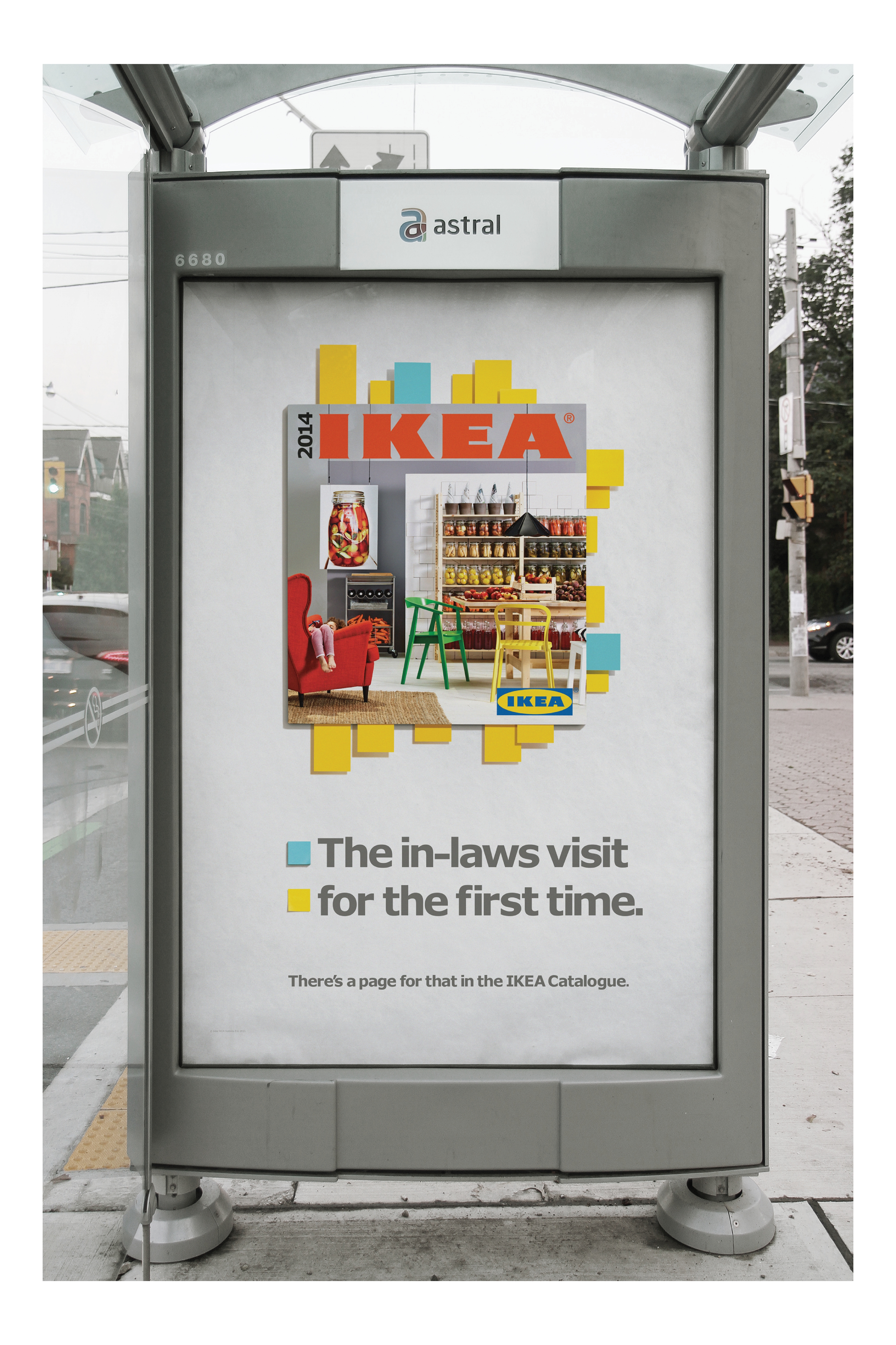
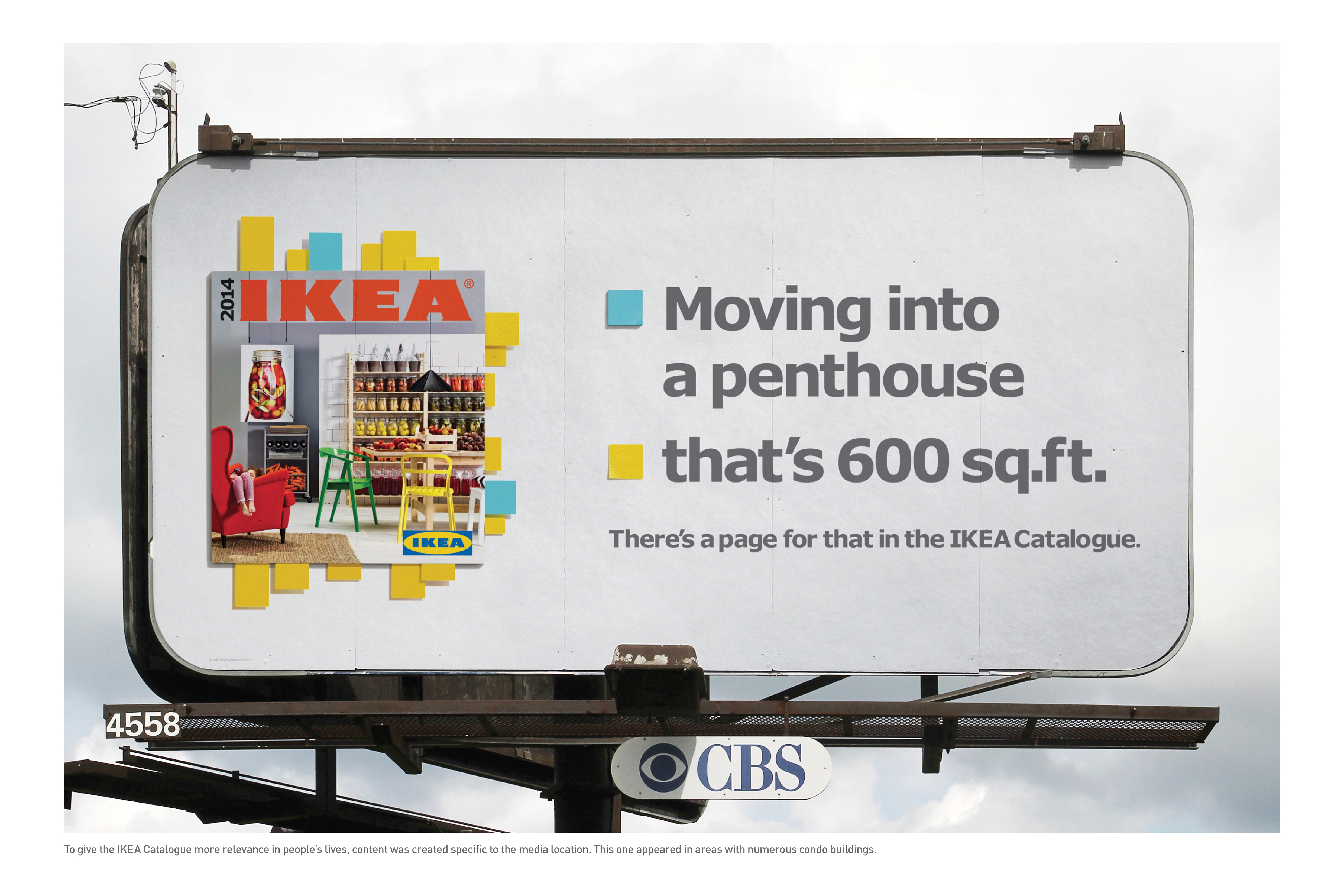
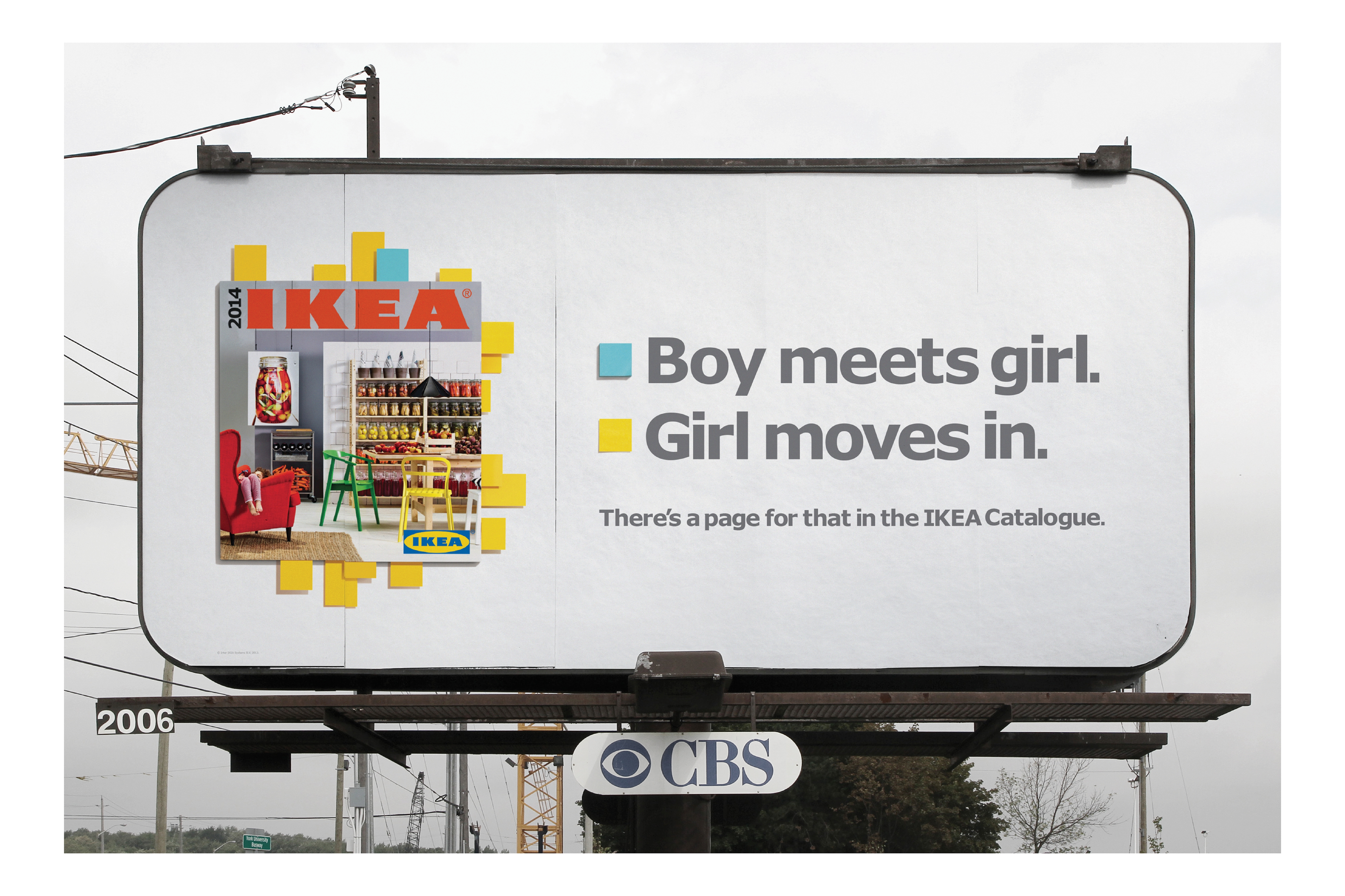
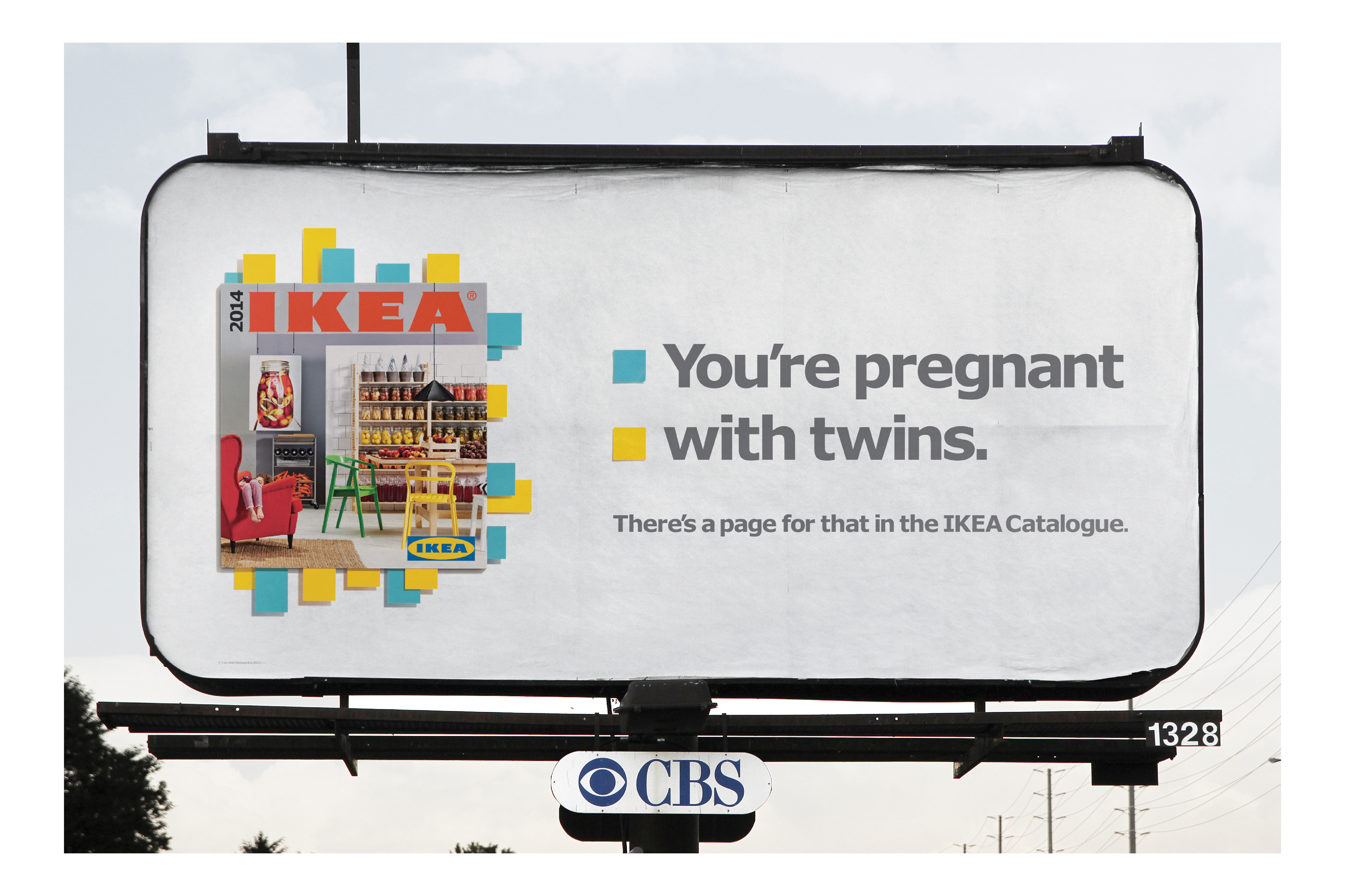
The Idea: There’s a page for that in the 2014 IKEA Catalogue.
Marking pages of the IKEA Catalogue with sticky notes is a universal consumer behaviour. We took this entrenched behaviour and iconic visual, and created stories around it. No matter the life stage or change people were planning for, big or small, IKEA had a page (or 10) to help make the most of it. The stories were summed up with a simple thought: “There’s a page for that.” A thought that transformed the book from Catalogue to inspired tool.
c)Media Discussion
Show the masses IKEA’s wide range of products and solutions.
We launched the campaign with six: 15 TV spots and a combination of large format billboards strategically located in high traffic zones and near local IKEA stores to trigger the shopping impulse, create intrigue for what’s inside the pages and drive intent to visit the store. OOH locations were meticulously selected to complement and provide context to creative headlines that called out specific life changes. For example, “You’re pregnant. With twins.” appeared on a billboard close to a hospital, while “Moving into a penthouse. That’s 600 sq. ft.” appeared near condos in the city.
Being in daily commuter papers ensured that we reached a large number of people going to and from work. A limited number of papers had an IKEA branded pad of sticky notes affixed to the front page, encouraging people to start marking their favourite pages.
An ambient display board was made out of real sticky notes and was in two high-profile OOH locations, allowing people to take away free pads of sticky notes to mark their new Catalogue.
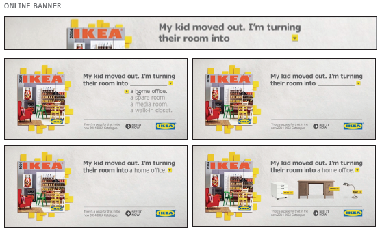
Rich media digital banners demonstrated the Catalogue as a solutions provider, where people could select a life change from a drop-down menu, and discover a range of IKEA products that could help solve their dilemma.
Section V — BUSINESS RESULTS
a) Sales/Share Results
Catalogue success? There’s a page for that too.
Recognizing the IKEA Catalogue’s role as a change management tool, leveraging the universal behaviour of marking pages of a book for reference, and using innovative and considered media created remarkable results amidst an anemic market decline.
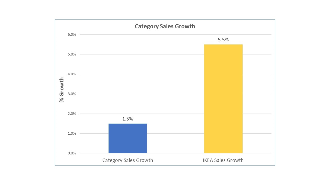
- The home furnishings market was up only 1.5% this period, while IKEA saw 5.5% in growth
- Visits to IKEA.ca were up 7% VYA, with Canada’s traffic the 3rd highest for IKEA globally during this period
- We exceeded both our sales and visitor goals by 3%
- 170,000 downloads of our catalogue app
- Total media impressions were 7,696,517
As it turns out, though digital inspiration is plenty, nothing can beat the tangible feel of kicking back and marking the pages of the 38-year-old IKEA Catalogue.
b) Consumption/ Usage Results
c) Other Pertinent Results
d) Return on Investment
Section VI — CAUSE & EFFECT BETWEEN ADVERTISING AND RESULTS
a)General Discussion
The results are extraordinary, flying in the face of the entire category given:
- There was no increase in spending or activity in IKEA’s 52-week advertising efforts compared to the previous year
- The timing of advertising of the IKEA Catalogue launch remained the same vs. the previous year
- No promotional efforts
- No extraordinary new product news
b)Excluding Other Factors
Spending Levels:
There was no increase in spend or activity in IKEA’s 52 week advertising efforts vs. the previous year. All increases in business objectives were a direct result of communications.
Pricing:
The IKEA Catalogue is free of charge.
Distribution Changes:
There were no major distribution changes.
Unusual Promotional Activity:
No extraordinary promotional discounts versus year ago were utilized.
Other Potential Causes:
There were no other potentail causes.
